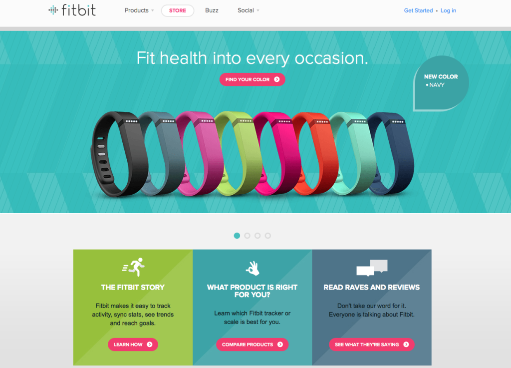
Design Trend Spotlight- Flat Design
Last month we mentioned some top design trends for 2014 so far. In the following months we’ll go a little more in depth on each of these, providing examples and ways to effectively use each trend.
There could be many reasons why design is venturing towards a more minimal, thin feel. Smashing Magazine article notes a few reasons why this may be the case and they are briefly summarized here:
1) Too much information
With the increase of technological devices, sizes, screens, etc. complicated design can tend to be a little overwhelming at times. Design simplicity can offer a break from information overload.
2) Simple apps = simple interfaces
With the shift towards simpler and cheaper apps, simpler interfaces follow.
3) Focus is away from design and more on content
Interface doesn’t need to get in the way when our primary objective is to text, talk, and use our mobile phone or device to get things done. Design aids in getting to where we want to go, not slowing the process down.
When designing with flat design, keep in mind that without extra design elements (drop shadows, gradients, etc) the color palette and typography will be that much more important when designing. Each element should be thought about both individually and as a whole with the rest of the design since they are standing out that much more than before.
With flat design, there is also the risk of going too simple and turning the icons or elements into more of a cartoon or childlike feel, which may or may not be the intended purpose. Just because the elements are simpler, does not mean they are not just as elegant. If done in the right way, flat design can be stunning.
Here are some good examples of flat design balancing functionality with simplicity.
TRIPLANET

CHILICONGRAPHIC
![]()
FITBIT
MEDICAL WORKS

TAASKY
BEDFORD HIGH SCHOOL
Sources:
http://www.smashingmagazine.com/2013/09/03/flat-and-thin-are-in/
http://pixelbell.com/flat-web-design/
http://www.taasky.com/
http://www.fitbit.com/
Bedford by Samuel James Oxley

